History Grid
Familiarize yourself with the history grid widget settings
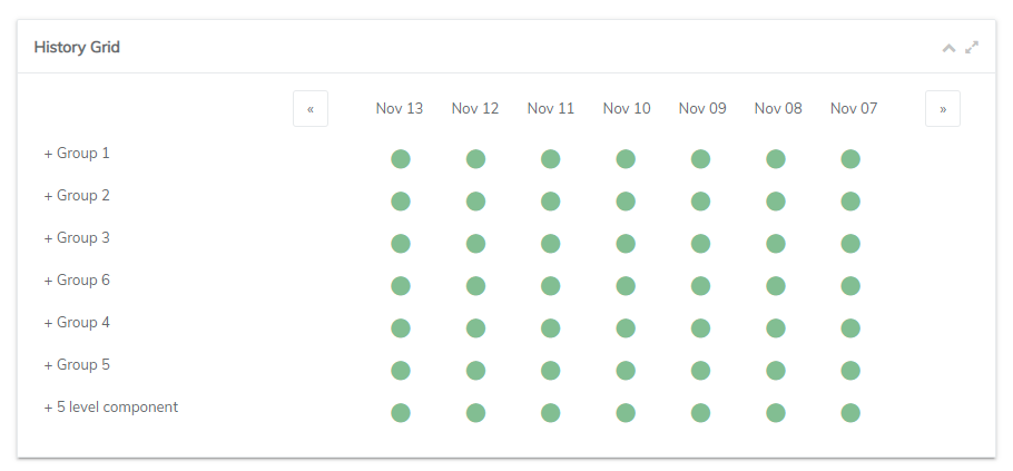
The history grid widget will display all your public components defined within your status page portal. This widget by default tracks the statuses of your components a daily interval.

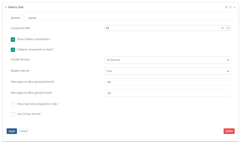
The history grid widget, by default, will display all components available, including any sub-components. Modify this by selecting an individual component or parent component from the Component filter dropdown.
The Include services dropdown will give you the ability to display between All services (components and cloud services), only cloud services, or only local services (components).
The display interval will allow the user to specify whether to render information on a daily, hourly, and 15 minutes basis.
Max pages forward/backwards allows you to control how far back in time or into the future that you allow the end user to go.

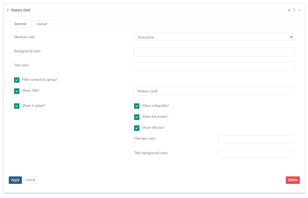
For filtering and design features, you will need to switch over to the layout tab. Here, you can define the level of visibility. Each widget will allow you to filter data depending on the role of the visitor or subscribers. The roles that are available with filtering include: Everyone, Subscriber, Employee, Manager, Administrator, and Company Administrator.

The layout tab will also allow you to edit the color of a couple things such as text, and background. This will save some time from the traditional search of elements and override with CSS.
Updated about 1 year ago
